We LOVE a good “Do it Yourself” project. In fact our love of DIY screen-printing and art-making is why we created Stickerobot.com 20 years ago.
In that time, we’ve printed hundreds of millions of stickers and created over 100,000 sticker packs. Now it’s time we shared our top secret (and extremely simple) formula…
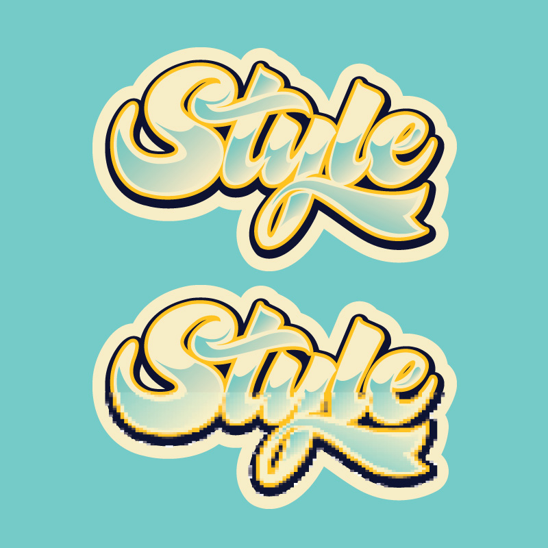
Famed illustrator Hydro74 shares his process for creating pixel effects in Adobe Illustrator.
We’ve printed hundreds of thousands of custom stickers for our friend Hydro74
Today he is sharing his technique on how to create custom pixel art, so you can add some Style, Flash, Pizzaaz to your next sticker design!
Check out the steps below and make Q-Bert Proud!
Step 1
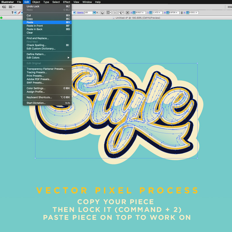
Copy the layer or group containing your art that you want to create the effect on.
Once copied, lock the current layer or group(Protip shortcut: command + 2). This will prevent the original art from being affected, and instead paste a copy of it onto a new layer above the locked art. This is the copy that we will create the effect on.
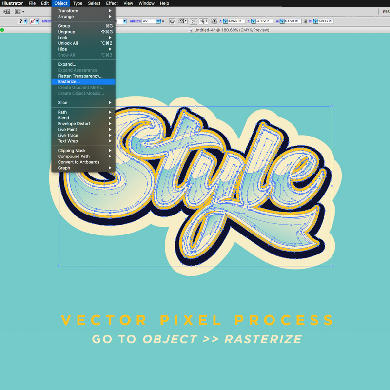
Step 2
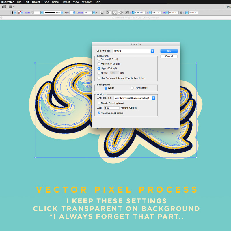
Select Object > Rasterize. Before commiting, be sure to toggle ‘Transparent‘ in the ‘Background‘ setting….
Step 3
Now click OK to rasterize.
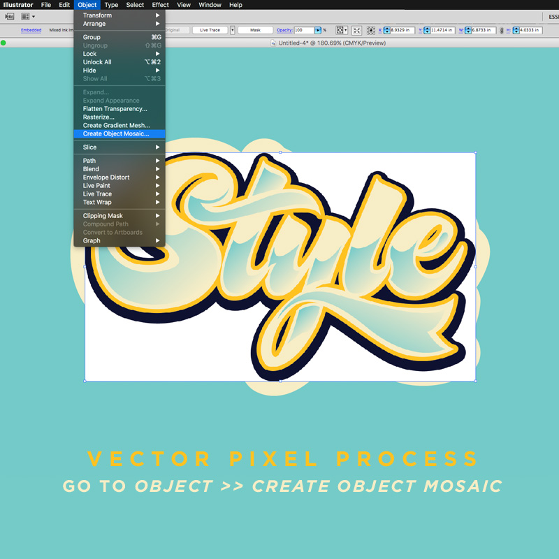
Step 4
With your artwork layer now rasterized, go to Object >> Create Object Mosaic…
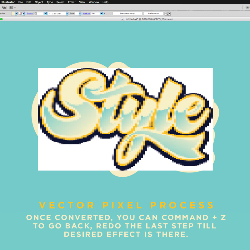
Step 5
Within the Mosaic options, you should experiment with the Height & Width fields within the Number of Tiles. (Note: Be sure to keep the numbers identical to keep the ‘pixels’ square).
Using a higher number of tiles makes more tiles and can retain more details, while the opposite is true when lowering the numbers.
Step 6
Once you have a desired number selected you can see the results by clicking ‘OK’.
And don’t worry if you don’t like the results as you can easily Command + Z to undo & then redo the last step until the desired effect is achieved.
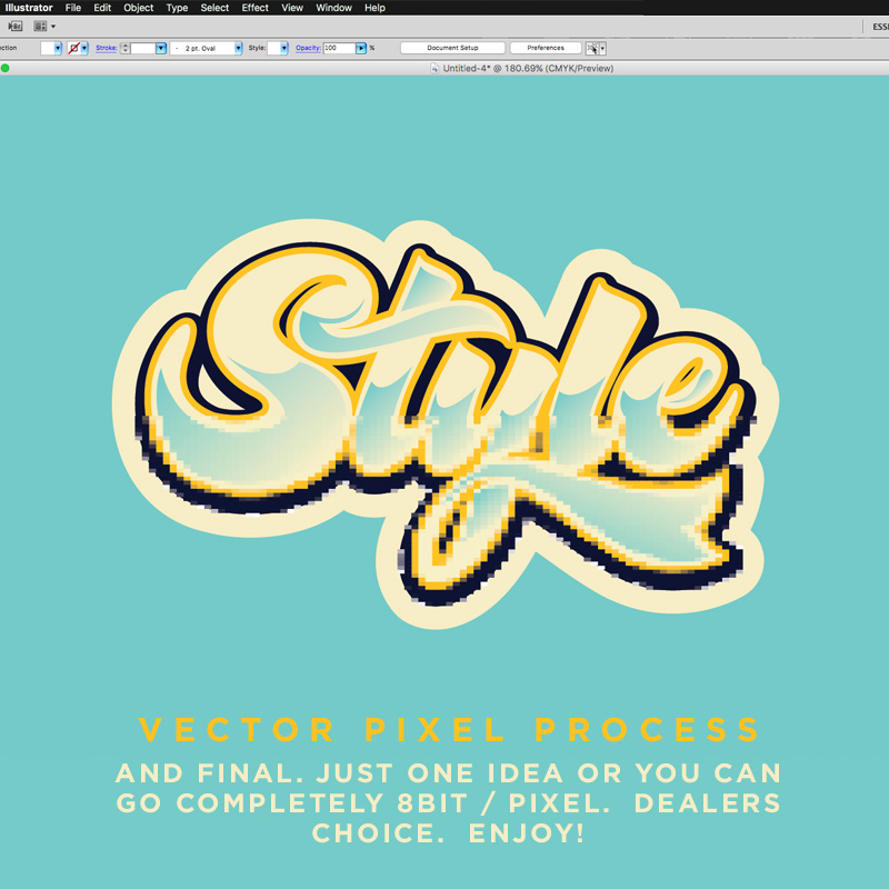
Step 7
Now that you have your pixelized art to your liking, you can use the open select tool to select and delete portions of the art.
I like to experiment here to see what works.
Step 8
And once you’ve found the right look and balance you can save the file.
This is just one idea using this technique. You can use this to make completely 8bit /Pixel art from your vector work, or do whatever you wish. Dealers choice. Enjoy!
Thanks for checking it out. Let us know what youy think and if you have any pointers of your own!
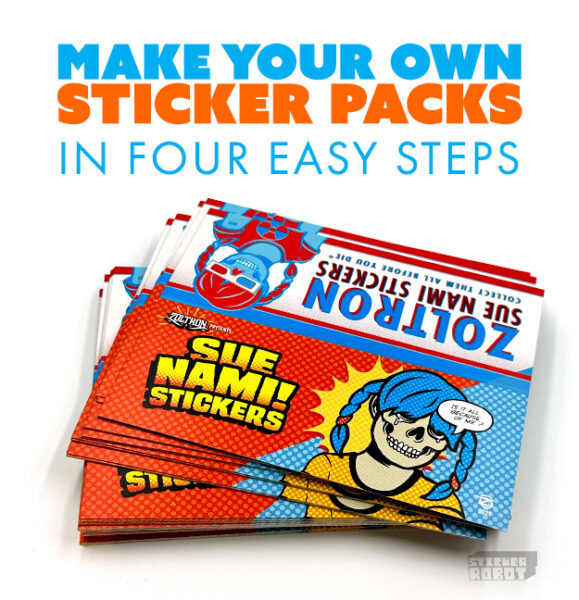
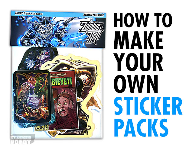
Hi. I’m Zombie Yeti, a freelance illustrator (with a heart of gold.) Recently I was asked to attend a gaming convention on very short notice. I needed to shill some wares and sling some merch, so I decided to make some quick and easy Sticker Packs. Here’s my simple home-made sticker pack formula.
(Editor’s Note: We’re giving away some of Zombie Yeti’s Sticker Packs. Like and Comment below to be entered for random drawing!)
This tutorial will show you how to make your own band stickers as multi kiss cut sticker sheets that are ready for printing; but at the same time teach you how to design a compelling band logo!
You might already have a band logo, but this post should give you some insights if you want to tweak it or come up with a cool new sticker design. You’ll want to think about how you can take your new design and turn it into other merch down the road but for now let’s just focus on stickers… Read More →
So… You use Adobe Illustrator and Wanna make easy Die-Cut Custom Shapes for your stickers… Who doesn’t !?
This is a mini tutorial for those of you that may not be Illustrator experts – but are versed enough to be dangerous…
Below you will find the historic first Sticker Robot video tutorial!. We suggest watching the video (and subscribing to get more) and then diving into the text below, which compliments with some additional snarky explanation (but not too much…)
Over the years, we have printed millions of stickers and in that time we have developed some good techniques on how to take advantage of Sticker Robot’s unique sticker printing methods. Our vibrant colors and overall sticker quality are world renowned, so today we want to share some simple tips on how to create the best quality full color, CMYK stickers…Read More →
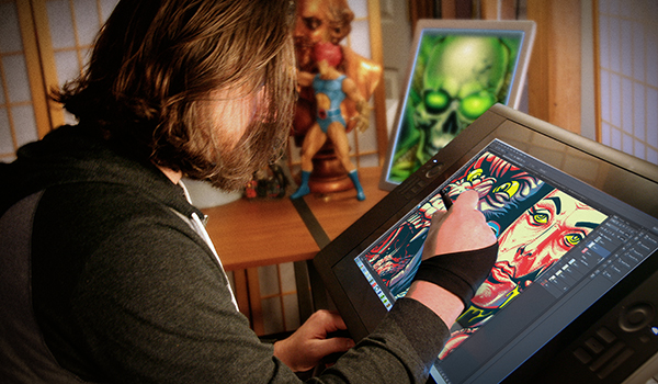
Recently Sticker Robot approached me and asked me to share my extensive, elaborate, and completely scientific process on making art for a sticker. I said I would not, but instead offered to give a generalized overview of my workflow. He thought about it, and then kicked me in the cock with one of his robot feet…
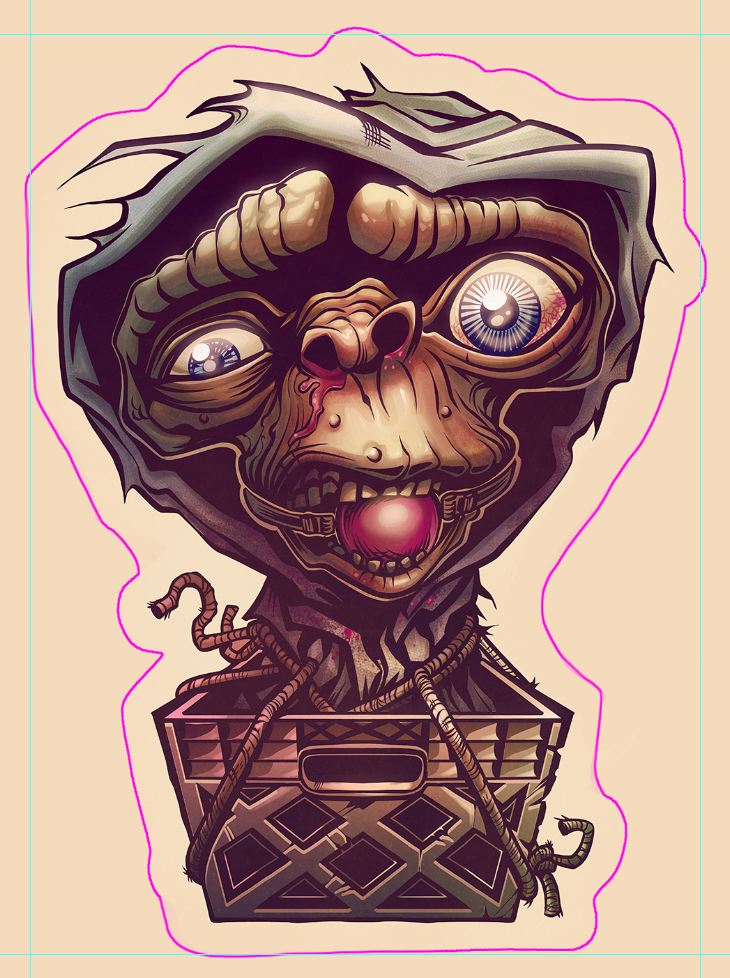
E.T. The Endearing Tutorial, How to prepare your custom stickers for press, directed by ZombieYeti
Well, hello! I didn’t see you over there… I’m afraid you caught me fresh from the shower. I’m so embarrassed, as all I have is this small hand towel for cover… I should probably get dressed, but I’m sure you’re in a hurry, so perhaps I’ll just begin…They call me Zombie Yeti (Editor’s note: Remember this? Anti Monsanto NoGMO stickers). I like drawing. I sometimes even draw things for people who give me money. I was recently approached by Bro-bot® and asked to share my extensive, elaborate,and completely scientific process on making art for a sticker. I said I would not, but instead offered to give a generalized overview of my workflow. He thought about it, and then kicked me in the groin with one of his robot wheels.*
Listen kids, you know there are many tools and many ways to make pretty pictures. So, make the pretty pictures in any way you want*. I won’t judge you!* …BUT TAKE HEED: satan has taken over the art world and requires your art be sacrificed to the digital ether in return for a continuing supply of internet porn and moderately decent AMC dramas! (Be warned! If you half ass it the AMC dramas will have episodes of ‘filler’!!!!)
…Also, to get your work printed these days, you’ll need to get them into a ‘computer machine’ at some point – so there’s that…
To that end, I work primarily digital from start to finish for maximum control and expediency (read: MAKE MONEY FASTER! AS SEEN ON TV! ENLARGE YOUR ‘COCK’! etc…).
This project was created using a *gasp* Windows based computer machine (PUNK RAWK! …although I do have a mac – put the gun down…) with a Wacom Cintiq 24 HD. I use many types of software, and pick and choose based on the process, desired output, and arbitrary roll of a 20-sided die. For this project I rolled Autodesk Sketchbook pro, Manga Studio, and Adobe Photoshop. And you can too!*
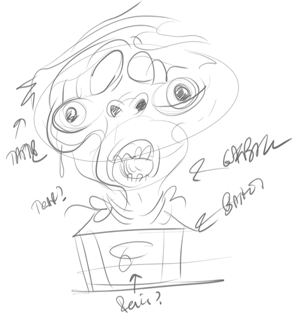
Chapter 1: Chicken Scratching Winning Ideas
PROtip: Originally E.T.’s space weiner was to be hanging out through the crate handle hole. True! Look closely at the rough sketch!
Question: “Mr. Zombie, can you please put some pant on?”Answer: Great question! The idea for this sticker was a very complicated process. I had recently finished my dissertation entitled ‘TWERK IT: Loss of Innocence in the 21st century’, and had just contracted a horrible virus from some Mexican bagged salad… It was during my 3 days of black outs and fever dreams that I decided to watch “E.T. The Extra Terrestrial”.
As I was removing one of the ‘never-ending-supply-of’ snakes that were crawling under my skin, I thought about Elliot & E.T.’s odd ‘physical connection’ and the whole plant/flower thing. Did you know Steven Spielberg was heard to say that the whole flower thing was a metaphor for Elliot & E.T.’s ‘loss of innocence’ after their first night together?* (Side note – Steven Spielberg originally coined the phrase ‘deflowered’!*)
So, after the fever broke and I received proper medical treatment for the snake holes in my skin – I started to sketch…
First off:
Sketching from an idea is great, but getting your idea from blindly sketching with no direction is often more rewarding!
I like to work quick and loose when I have no preconceived idea. I’ll often lay down general shapes for compositional targets to give a framed target to the play-field.
For this project, I turned on my ‘heartlight’. I reached deep into my psyche, and tried to picture an alternate take on E.T. for the 21st century…
I was picturing an aged and frail E.T. alone in an abandoned shed. Living there, tied to a milk crate removed from Elliot’s bike many years ago… Sheltered in darkness, with only a small hole in the roof for light, and a battered body of scars and bruises for companions… Living in constant fear of the inevitable returning visitor that takes shape in the form of a matured Elliot… (A superfluous side note: Elliot was in a car accident years prior that left him with a limp, a bit deranged, and super mega horny!)
…If you like where this is going, you can read more about this in my upcoming “E.T./Quantum Leap” fan-fiction cross-over novella: “I Want You to Kill Me, Ziggy”.
Chapter 2: Solidifying with Sketchbook, Bro
For sketching I use Autodesk Sketchbook Pro. I like it. It has low overhead, great responsiveness & a simple interface. It also doesn’t judge me.
First off:
I drop in my chicken skratch to a layer just so i get the general proportions and flow if there is one (in this case, I’m not so sure there is anything redeeming, but I’m respectful of my marks and don’t want to hurt their feelings).
Second:
I then make a new layer to work on. It’s here I’ll start to refine the drawing and drink liquor.
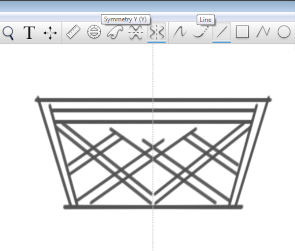
An example of the usefulness of sketchbook pro is with the milk crate in this piece. It is pretty much head on and makes for a great symmetrical element. As such, sketchbook pro has great symmetry tools and straight-line tools to help us expedite this more mechanical element.
Now, obviously, you could draw half of it and copy/flip it in the end. Of course, drawing half and seeing it all in real time is better and more natural – it allows you to gauge the full composition while also cheating like a bastard!
Question: So how you do it, Mr. Yeti? How!? TELL ME! I’m a cheater!!!!!!Answer: Click on the horizontal symmetry tool and in this case, the straight line tool to speed things up. Then draw lines on one half of the page and watch them magically drawn on the other!!!! VOOOOOODOOOOOOOOO!!!!!!!!
Once the main lines for the crate are in place, I’ll turn off the straight line tool and symmetry tool (just click on them icons again) and then start refining the forms.
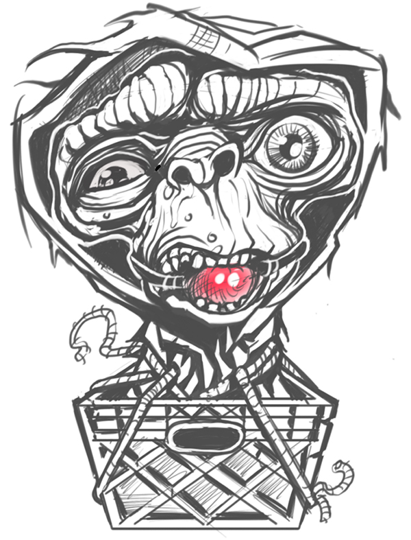
Third: Solidify the shape and forms until you’re happy with the sketch. I will sometimes leave areas intentionally loose and decide on the refinement in the ink stage. This is a personal preference that really is a result of a personal distaste for following the rules. (PUNK RAWK!!!!)
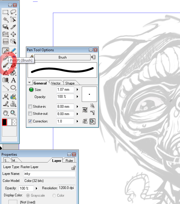
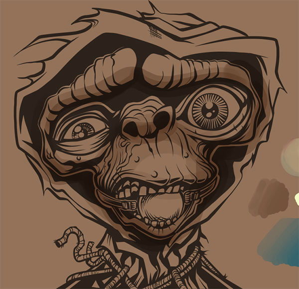
Chapter 3: Inking with Manga Studio
Why use manga for inks? Manga Studio has the most natural feeling ink tools of any software I’ve used. The program is robust with low overhead, so it’s great for moderate rigs as well.
Using a wacom tablet or Cintiq, the toolset and pressure sensitivity can be adjusted to a near perfect digital facsimile of pen and ink. I also recommend a felt or flex nib to give you good drag like pencil on paper. (I like drag!)
First off:
I create a new document in Manga Studio and bring the sketch in (copy/paste works fine from sketchbook pro). I then resize to my liking and take the opacity of the sketch layer down to around 20% and then create a new layer to start inking on.
Second:
For my workflow, I select the pen tool (NOT THE BRUSH TOOL) and using the sub menu (DOUBLE CLICK THE DESIRED TOOL ICON), choose a pen of my liking. I like to use ‘brush’ for broad work and ‘g’ for fine detail work. Ultimately, it’s what you’re comfortable with. My brush pen settings are pictured below.
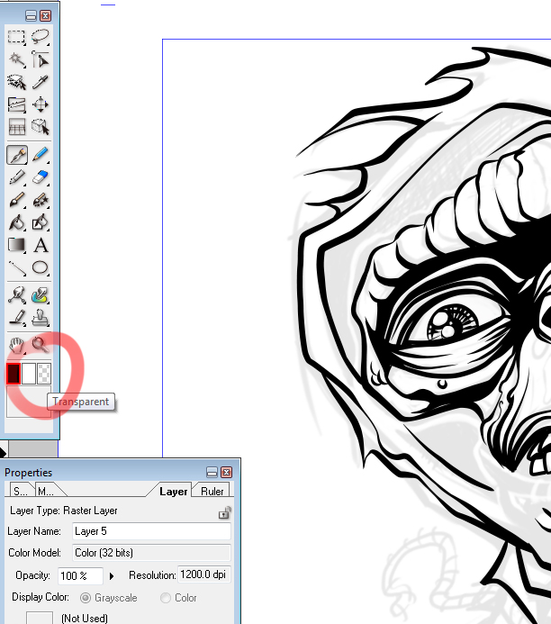
PROtip: don’t use the eraser tool. Instead, you can select to use any pen or brush with a transparent ink that essentially erases just like the eraser but with your comfortable and familiar settings. Another tip? You can use superglue as a substitute for contact re-wetting drops!*
Lastly:
Once I’m finished with my inky lines, I need to get the inks out of Manga Studio and into Photoshop. Why? Just to prove I’m in control.
From the file menu, select ‘export’ and export your image in the format of your liking. I usually choose BMP – so suck on that TIFF, you cocky son of a bitch!
Chapter 4: Color with Photoshop
First off:
“Working larger and then reducing helps create and retain detail” – Steven Speilberg
I create a new CMYK document with the proper sizing I want to use. I chose to work at twice the physical size of my sticker at 300dpi (300dpi is the minimum dpi you should work with for your sticker, for best results). So, for instance, if you’re sticker is to be a 2″ x 4″ in the end, I’ll work it at 4″ x 8″. After I’m finished with the color I will bring the file size down to match the output.
Once the document is created, I open my exported ink work from Manga Studio (in photoshop, stupid!) and drop it in a layer of the new document. You can use your line work over a new color layer and select ‘multiply’ to see through to the color, or you can go to ‘select>color range‘ and cut out your lines (I prefer this as i like to play with my line colors).
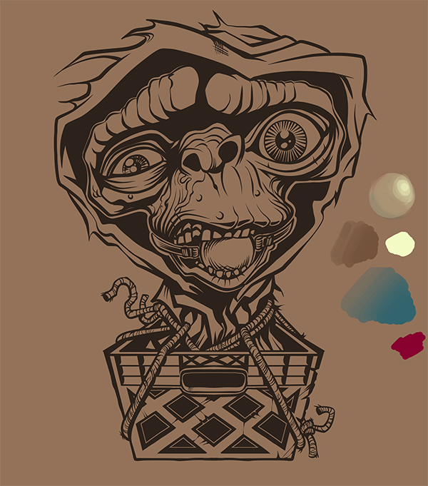
Now that the document is ready for the color, I’ll usually drop in a midtone background for a base. Often just a warm or cool grey, but for this I created a warm brownish hue (reminds me of that salad). Why? ‘Cause I can! I’M IN CONTROL!!!!!
I’ll then rough out my palette, grab a few accent colors and play on the sides to get some sort of approach.
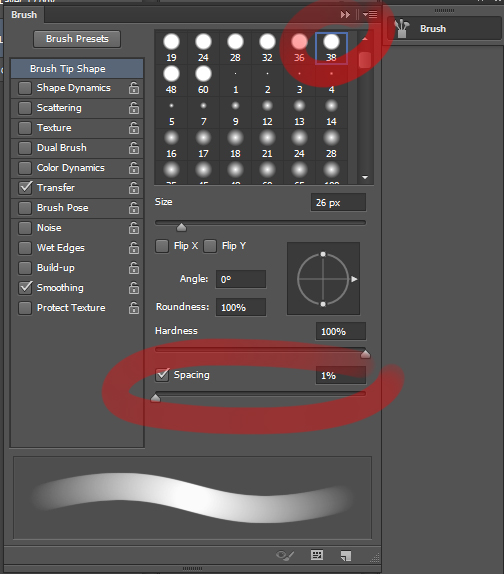
Second:
This admittedly is only my 3rd digital painting, so do seek out experienced folks for a digital painting tutorial. That said, I primarily use a default round brush with various opacity and flow settings. One thing that is important if you want to keep your strokes smooth like a criminal is the spacing setting of your brush. This is cpu intensive so depending on your rig, you may have to settle a bit, but if possible – turn it down to 1%.
Third:
I always start from the middle tone and work darks first, then light, and lastly highlight. Why? No clue – personal preference? Brain wiring? Large genitalia? Probably a combination.
In this case, I select the background color to start, since it is really our base fleshtone. I’ll create a new layer and set it to multiply. I then lightly drop in shadow areas with my brush opacity at around 50% and try to – really quickly and roughly – bring out the form.
Fourth:
“At that point you can choose to flatten color areas and continue to refine, or squash that bastard down to half size and have it refined for you” – Steven Spielberg
As I work to bring the form into focus, I often turn down the ink layer to get a gauge on the form. In this case, I have no reference to use so I’m more concerned with generalizing the light and faking some dimension than making a photographic representation of the alien mofo.
In early stages, I work using a handful of layers to experiment. I’ll work at low opacity until I’m more comfortable with the direction and then I merge the layers and begin to work more opaque.
I’ll continue to push and pull areas of light and dark until I’m relatively happy with things.
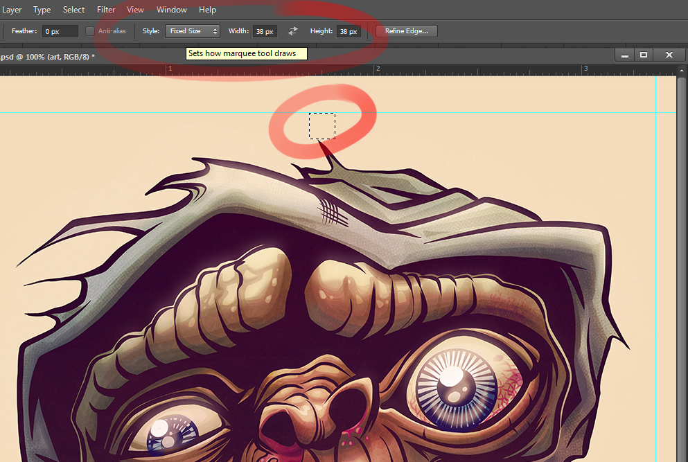
Chapter 5: Prep That Sticker for Printing
First:
Since I decided to do a die-cut custom sticker I need to create the die line that will be used to cut the shape. It’s important to have this 1/8″ away from the artwork since it can move ever so slightly in the printing process and you don’t want to clip the artwork, now do you?
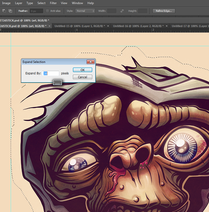
PROtip: at 300dpi : 38 pixels is the equivalent of 1/8 inch.
Knowing this, I use the ‘marquee‘ tool to create a fixed size selection of 38 x 38 pixels. I use this as a measurement tool. I move it to the furthest bits of art on all sides & drag a ruler guide to give me an idea of my safe zone for the die cut. This isn’t necessary, but can be helpful when refining your shape in the next step.
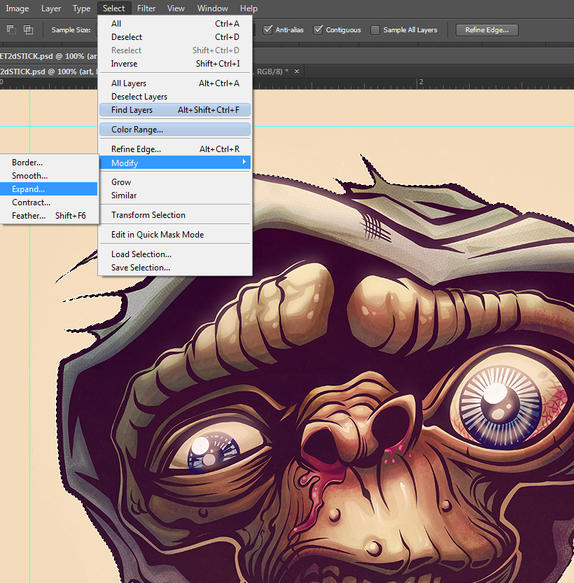
Second:
Select your artwork, ignoring the background. From that selection, choose ‘select>expand’ and expand it by that magical number: 38px. This gives you a rough die cut outine that you can tweak in various ways to you liking. I tend to use this die cut selection to create a new layer & fill it a solid color. I can then add and subtract to it until it looks sexy.
Third:
Once the shaping is to your liking, use your selection and ‘edit>stroke‘ that bitch! (3px width stroke for the sake of readability at 300dpi, says me)
…And ‘Knowing’ is Half the Battle!
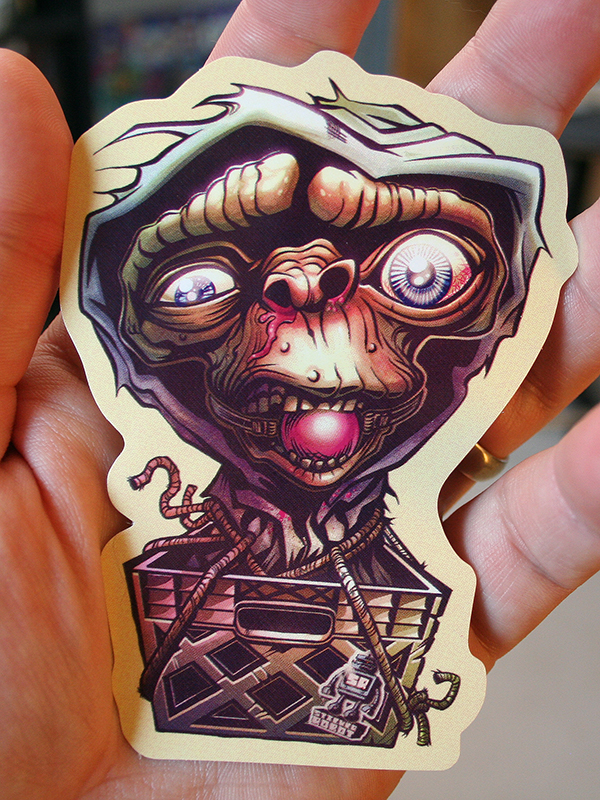
Once you’re sticker art is ready to roll, place your order (with stickerobot.com, punky brewster!) and then set up camp by your mail box and wait for your stickers to arrive! Be sure to bring a bottle or can to save your bodily waste and a plenty of glue for sniffing!
So, you want a FREE E.T. sticker?
So, you’re a cheap bastard, eh? Boy, are you are in luck!
Obtain your free Zombie Yeti E.T. Sticker in TWO easy steps!!!!1. Leave a snarky comment, or the title of your E.T./Quantum Leap dream novella, below!2. Send a S.A.S.E. to:
Zombei Yeti Studios C/O Enlargement Pills P.O. Box 622 New Paris, IN 46553Bonus stickers for the most embarrassing envelope art!*LIES! LIES! LIES!1960’s Batman Action Figure says ‘I don’t think Stephen Spielberg said those things…’ And don’t forget to socially stalk me (Zombie Yeti) on Facebook, Twitter, and Instagram and Xbox Live & PSN as ‘YourMom’!
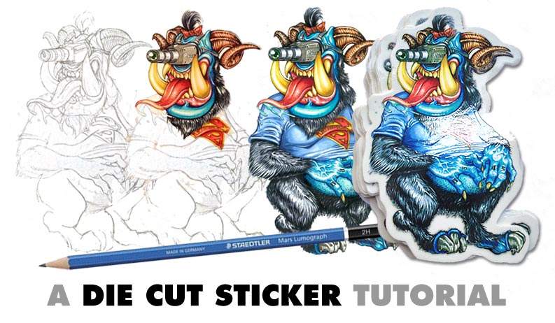
Hello, my name is Jake Gillispie, and I am a sticker addict.
I’m also a sticker artist and the one man wrecking crew behind Grindhouse Graphix in Phoenix, Arizona. The good people at Sticker Robot are handing me the mic today, so I’m going to share my steps of creating a hand drawn sticker and then getting it print ready for Sticker Robot to make into custom vinyl die cut stickers…
Read More →
The following is a very cool step by step Sticker Tutorial on how to create some custom Clear Vinyl Laptop Stickers, that will glow when placed on your laptop…

 Question: So how you do it, Mr. Yeti? How!? TELL ME! I’m a cheater!!!!!!
Answer: Click on the horizontal symmetry tool and in this case, the straight line tool to speed things up. Then draw lines on one half of the page and watch them magically drawn on the other!!!! VOOOOOODOOOOOOOOO!!!!!!!!
Question: So how you do it, Mr. Yeti? How!? TELL ME! I’m a cheater!!!!!!
Answer: Click on the horizontal symmetry tool and in this case, the straight line tool to speed things up. Then draw lines on one half of the page and watch them magically drawn on the other!!!! VOOOOOODOOOOOOOOO!!!!!!!!
 PROtip: don’t use the eraser tool. Instead, you can select to use any pen or brush with a transparent ink that essentially erases just like the eraser but with your comfortable and familiar settings. Another tip? You can use superglue as a substitute for contact re-wetting drops!*
 Lastly:
Once I’m finished with my inky lines, I need to get the inks out of Manga Studio and into Photoshop. Why? Just to prove I’m in control.
From the file menu, select ‘export’ and export your image in the format of your liking. I usually choose BMP – so suck on that TIFF, you cocky son of a bitch!
Lastly:
Once I’m finished with my inky lines, I need to get the inks out of Manga Studio and into Photoshop. Why? Just to prove I’m in control.
From the file menu, select ‘export’ and export your image in the format of your liking. I usually choose BMP – so suck on that TIFF, you cocky son of a bitch!
 Second:
This admittedly is only my 3rd digital painting, so do seek out experienced folks for a digital painting tutorial. That said, I primarily use a default round brush with various opacity and flow settings. One thing that is important if you want to keep your strokes smooth like a criminal is the spacing setting of your brush. This is cpu intensive so depending on your rig, you may have to settle a bit, but if possible – turn it down to 1%.
Second:
This admittedly is only my 3rd digital painting, so do seek out experienced folks for a digital painting tutorial. That said, I primarily use a default round brush with various opacity and flow settings. One thing that is important if you want to keep your strokes smooth like a criminal is the spacing setting of your brush. This is cpu intensive so depending on your rig, you may have to settle a bit, but if possible – turn it down to 1%.
 Third:
I always start from the middle tone and work darks first, then light, and lastly highlight. Why? No clue – personal preference? Brain wiring? Large genitalia? Probably a combination.
In this case, I select the background color to start, since it is really our base fleshtone. I’ll create a new layer and set it to multiply. I then lightly drop in shadow areas with my brush opacity at around 50% and try to – really quickly and roughly – bring out the form.
Third:
I always start from the middle tone and work darks first, then light, and lastly highlight. Why? No clue – personal preference? Brain wiring? Large genitalia? Probably a combination.
In this case, I select the background color to start, since it is really our base fleshtone. I’ll create a new layer and set it to multiply. I then lightly drop in shadow areas with my brush opacity at around 50% and try to – really quickly and roughly – bring out the form.
 Fourth:
 Second:
Select your artwork, ignoring the background. From that selection, choose ‘select>expand’ and expand it by that magical number: 38px. This gives you a rough die cut outine that you can tweak in various ways to you liking. I tend to use this die cut selection to create a new layer & fill it a solid color. I can then add and subtract to it until it looks sexy.
Second:
Select your artwork, ignoring the background. From that selection, choose ‘select>expand’ and expand it by that magical number: 38px. This gives you a rough die cut outine that you can tweak in various ways to you liking. I tend to use this die cut selection to create a new layer & fill it a solid color. I can then add and subtract to it until it looks sexy.
 Third:
Once the shaping is to your liking, use your selection and ‘edit>
Third:
Once the shaping is to your liking, use your selection and ‘edit>